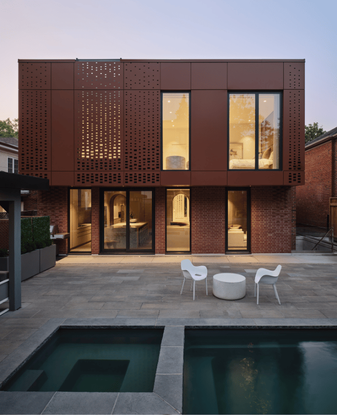
House 71 began with a wish list that typically leads to a new build—higher ceilings, more natural light, more space, more openness—yet the homeowners were adamant about keeping the original front façade for its character on the street.
That tension became the core challenge: Maintain the front façade without letting the back feel like a separate project.
The solution was a rear addition that reads as a true continuation—matching brick tone, reworking the pattern with a textured update, and wrapping the home in brick-toned perforated panels for privacy. To deliver the full brief, Jordan Livings (Project Lead, Izen Architecture) partially demolished the rear and built a three-storey addition—basement, ground, and second—bringing soaring ceilings and dramatic finishes while keeping the front presence intact.
kuultip: A good renovation shouldn’t look like an add-on.
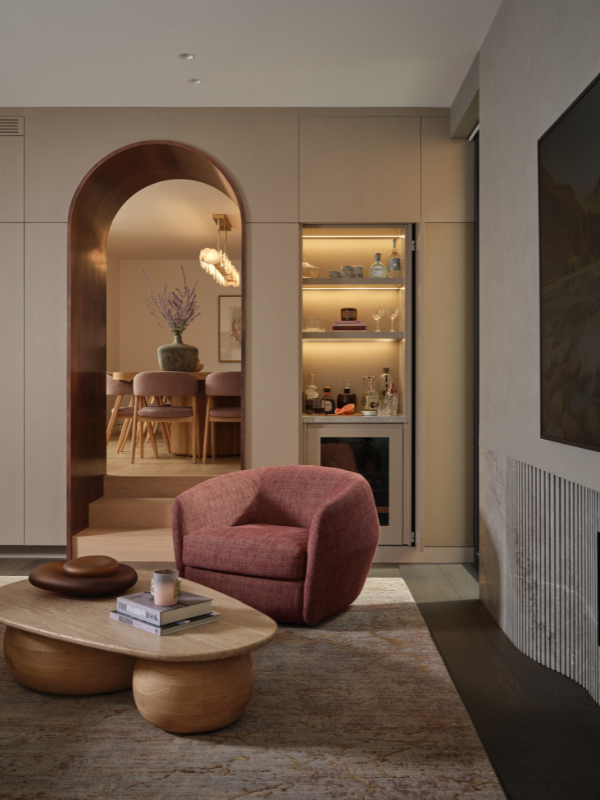
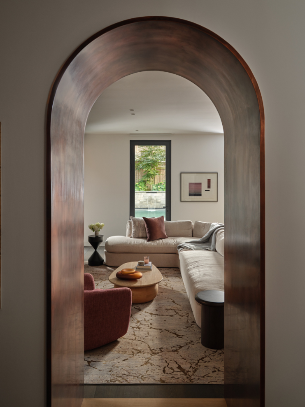
Inside, the home reads as one continuous idea because the detailing is consistent—same lighting throughout, same windows throughout—while a series of copper archways act as portals that frame views and guide movement. You get glimpses of what’s ahead, but the reveal only fully lands once you’re within the next space, especially as you descend the stairs.
kuultip: If a house feels effortless, it’s usually because the details weren’t.
"Curves…guide people intuitively through space, slow movement at points of reveal, and create moments of anticipation."
Brenda Izen | BCA
Curves carry that sense of ease. Felt in the arches, the stair, and the island, they guide people intuitively, slow movement at key moments of reveal, and create anticipation—softening the home’s natural palette so it feels warm and welcoming.
kuultip: Curves help guide how you move through a home.
Light as a building block
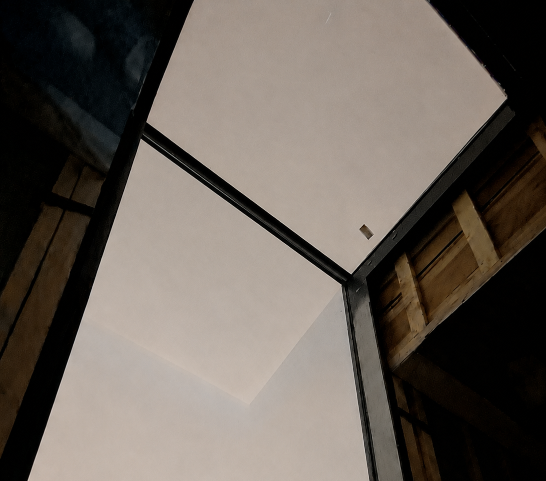
The doors delivered one of the most demanding details in the home – an oversized window-to-skylight curtain wall—where every part of the solution had to be resolved: water management, curb concealment, flush alignment to millwork and bathroom walls, and a perfect connection between two massive installed pieces.
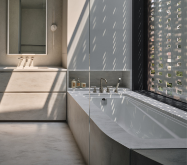
The payoff is unexpected. With triple glazing, sunlight passing through the perforated privacy panels is reflected and distorted three different times—creating a kaleidoscopic pattern that turns the bathroom into a genuinely magical space.
kuultip: The best glazing balances daylight, privacy, and comfort.
The stair as structure
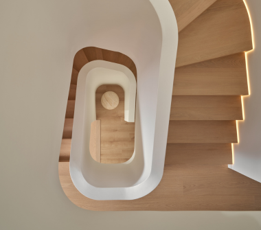
The staircase was detailed to feel minimal and subtle—consistent with the finishes of the home’s front half—while keeping continuity of curve and guard as the priority. Berman’s engineering solution makes the guard structural (layered plywood), allowing the stairs to build off the guard with no stringer.
Because Izen Architecture doesn’t use trim on stairs, every junction has to be perfect—stair to guard, stair to wall—made even more complex by the continuous recessed strip lighting integrated into the stair.
kuultip: If the stair is a focal point, the details—guard, joints, and lighting—matter.
Stone that doesn’t feel “assembled”
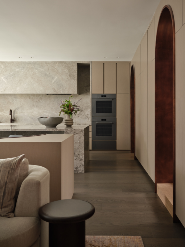
In the kitchen, materials are rich and natural—different textures, same tone—with stone acting as the primary anchor across counters, backsplash, island, and hood. Stone also enabled the curve of the island, a key design theme in the home’s softer, more welcoming experience.
To make the curve feel continuous, Costa Marble fabrication becomes everything: thin pieces are cut and sanded so the island reads as one smooth move. And because Izen Architecture avoids bookmatching, slabs are composed to feel like a single block—never pieced together.
kuultip: The stone matters, but fabrication matters more for the desired look.
“The true measure of successful design is when it feels effortless…even though it’s painstakingly detailed.”